A practical guide from Sketchso
Faint Tracing Outlines: What They Can and Cannot Do
“Invisible outline” is a description often used for a very light guide, not a special kind of ink. A useful guide gives you enough information to place your subject while leaving room for your own drawing. Whether it remains visible depends on how you transfer it and what you put over it.
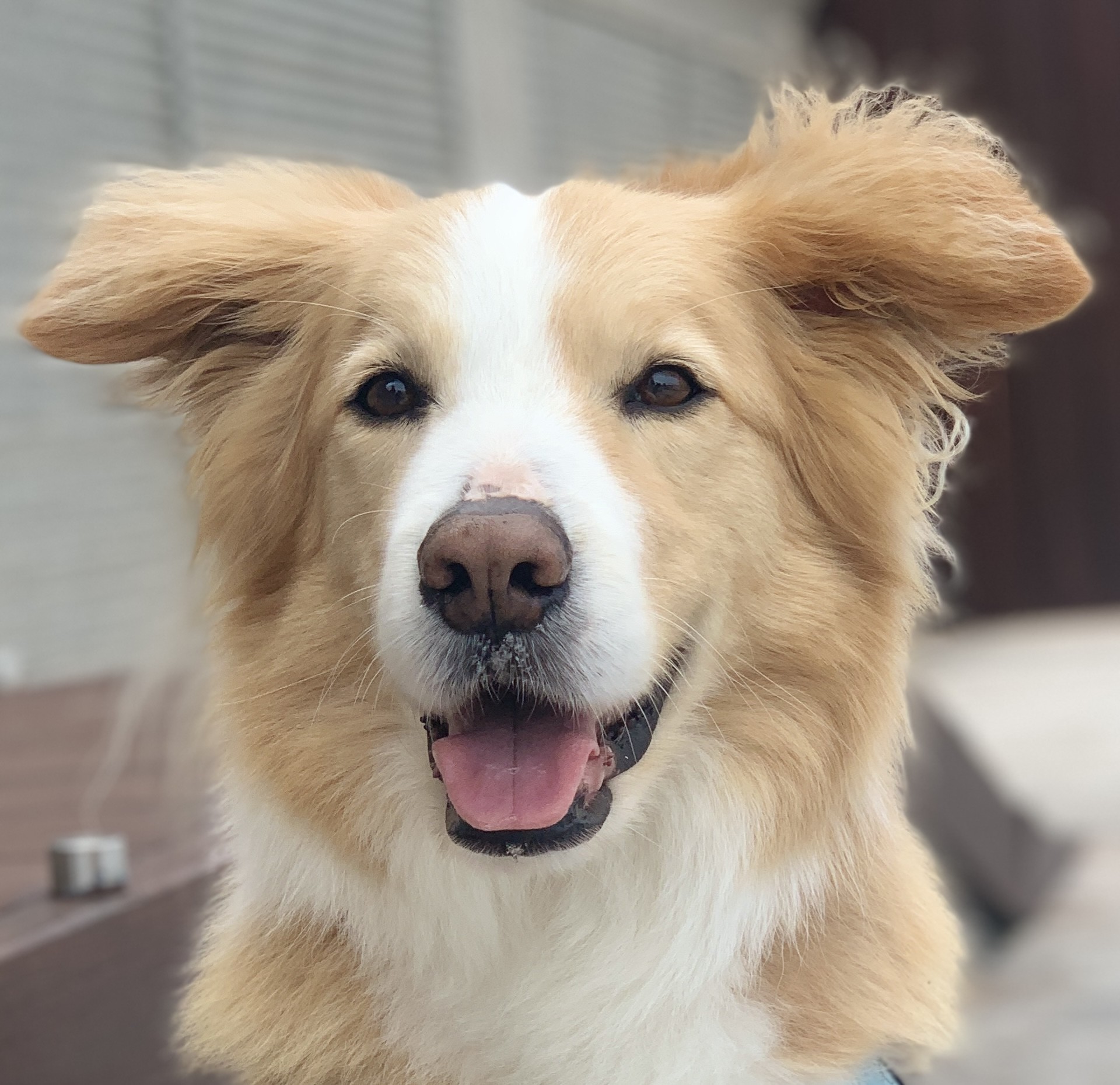
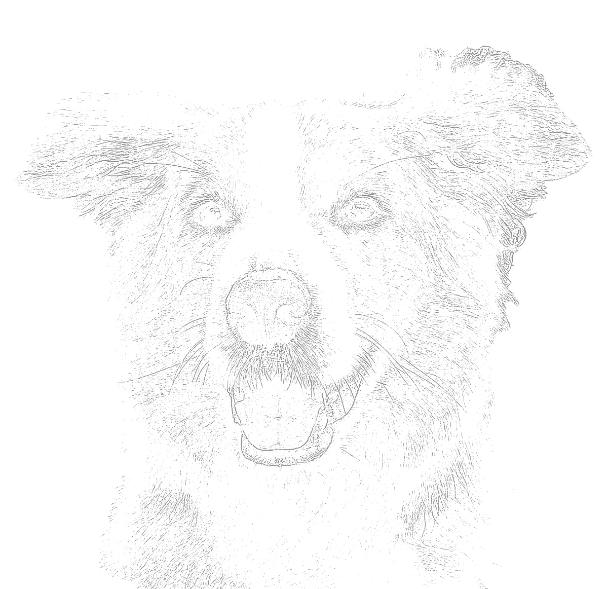
Separate the digital outline from the physical mark
On screen, lowering opacity blends the line toward the white background. On paper, the printer makes a physical ink or toner mark. That mark does not become erasable because its source file was faint. Pale passages in a painting may leave it visible, and some inks can spread when touched with water.
A graphite transfer is different. The print acts as a guide while graphite is deposited on the artwork surface. A light graphite mark can often be lifted before painting. Paper texture and pressure affect the result, so test a short line before transferring the full image.
Decide what the outline must explain
Choose three to five landmarks before adjusting the converter. In a face, these might be the corners of the eyes, the bottom of the nose and the chin. In a building, look for roof angles and major verticals. If the preview loses those landmarks, try a more detailed setting or a clearer reference.
More lines are not automatically more useful. Hair, fur, grass and rough backgrounds can fill the page with edges that distract from structure. Begin with a simple preview, compare it with Balanced, and erase the lines that do not help you place the main forms. An edge-based converter does not understand which marks are important to your particular artwork.
Choose a line appearance for the job
For tracing through paper, the guide underneath needs to be visible enough to follow. For a direct print under a pale painting, start much lighter and test the lightest wash. For a graphite transfer, the darkness of the print matters less than the pressure you apply while tracing.
Gray is easy to compare against a photograph. Blue can help you distinguish construction marks from later pencil work, but it is not guaranteed to vanish in a painting or photograph. Pick a color because it helps your workflow, not because the name implies a material property.
Print at the intended scale
Select the artwork area before printing. A proportional fit may leave white space when the photograph has a different shape from your canvas. Stretching it to fill the rectangle changes the subject’s proportions. Crop the source deliberately if filling the full shape matters to the composition.
Use actual size or 100% in the print dialog. Measure a known test square rather than assuming a PDF will print correctly. For tiled output, match the overlap and alignment marks before taping the pages. Check important features at the joins before transferring anything permanent.
Use the guide as a starting point
After transfer, compare the large shapes again. A misplaced eye or a tilted horizon should be corrected now. Keep the photo available for shading, color, reflected light and edges that the outline intentionally omits. You can soften or redraw a guide mark when the painting needs a different edge.
To practice observation as well as finish a project, draw a small freehand study first, compare it with the reference, then use the outline for the final composition. This lets the guide solve placement while the study reveals which relationships you are still learning to judge.
Questions before you start
Can I erase a printed outline?
Do not assume so. Ink and toner are different from graphite. If you need removable marks, print on ordinary paper and transfer lightly with graphite instead.
Does a faint guide guarantee an accurate portrait?
No. The guide follows visible image edges. Inspect the eyes, nose, mouth and overall shape yourself, especially when the source is blurry or strongly shadowed.